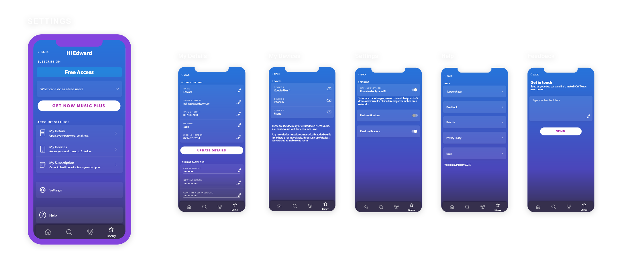
NOW Music app
NOW That’s What I Call Music wanted to move into the digital space. They had an MVP thrown together that they weren’t happy with from a design or UX perspective. We were brought in to give the app it’s own visual identity that sat within the NOW That’s What I Call Music brand.
B U I L T W I T H


B R A N D I N G
Logo
For a brand with such a strong visual identity. Virtually no branding assets were available when picking up the project. This first task was to rebuild the logo maintaining the NOW That’s What I Call Music heritage in a way that let us broadcast their new digital product and maintain it’s visual identity.
Brand recognition was one of Now That’s What I Call Music’s greatest assets. For that reason only minor changes to the logo could be made. We remodelled and textured the original logo from scratch.


Typography
We revamped the apps typographic hierarchy. Drastically narrowing the size and weight range to simplify the user experience while still facilitating the apps tone of voice.

Colour
NOW That’s What I Call Music’s album covers are an explosion of colour. We needed a colour pallet that could act as a canvas to those covers. Hues of calming blues and purples were chosen as the apps primary colours after extensive testing and competitor analysis.

Tertiary Colours
We did a colour analysis of the last 20 years of NOW That’s What I Call Music album covers and distilled a tertiary colour list from that. This gave the NOW app it’s own identity.

Iconography
The NOW That’s What I Call Music albums have a strong visual impact. We wanted the iconography to work with that aesthetic. Taking colours from the 106+ albums released, fine tuning and applying them into simple icons that reflect moods the content team wanted to convey.

Homepage
The NOW Music app was hard coded when we arrived. This meant developers had to be instructed on what albums to display in the old layout. As the userbase grew a more diverse range of listening habits needed to be catered to and this wasn’t possible with a hard coded homepage.
We designed the page dynamically around components. Not only could the order of elements on the homepage be changed on an individual basis, but also the content within those components.
Carousel Component
We started with the carousel component. Where the contents of the carousel could be changed by the content team, or set up with tags to show personalised content. For example a users most listened to albums or playlists.

Radio Component
We were able to generate radio stations based off user listened for genres artists and moods within the app. We wanted to bring these to the users homepage based on their own listening habits. For example someone listening to a lot of Ariana Grande could see a Pop, R&B and Arian Grande stations in their radio carousel.
Content Lenses
We also wanted to bring relevant genres out of the search menu and into the homepage. These would change according to a users most listened to genres. We also included the ability to program genre’s in for holidays and world events.

Editorial
Editorial components thought the CMS allowed us to bring the content team’s excitement for music to the user and give the app a human touch.

Web Link
We also created a component that would let the content team link out of the app. This let us run deals and campaigns from the the website and advertise them in app.